 Sign up with Google
 Sign in with Zoho

Driving traffic to an online store is one challenge. Converting that traffic into completed sales is an entirely different one. Many retailers invest heavily in advertising and search visibility, only to find that their checkout process quietly undermines the investment.
Cart abandonment rates tell the story plainly. Across the industry, a majority of shoppers who begin the checkout process never finish. While some of this is driven by comparison shopping or distraction, a meaningful share stems from design problems that are both identifiable and fixable.
The checkout is where purchase intent meets execution. When execution falters, even motivated buyers walk away. Below are the features that most directly prevent that outcome.
Make Sure Shoppers Can Always See Their Cart
The cart icon serves as the customer's ongoing confirmation that their selections are saved and accessible. If that icon is difficult to find or fails to update accurately, confidence in the process erodes.
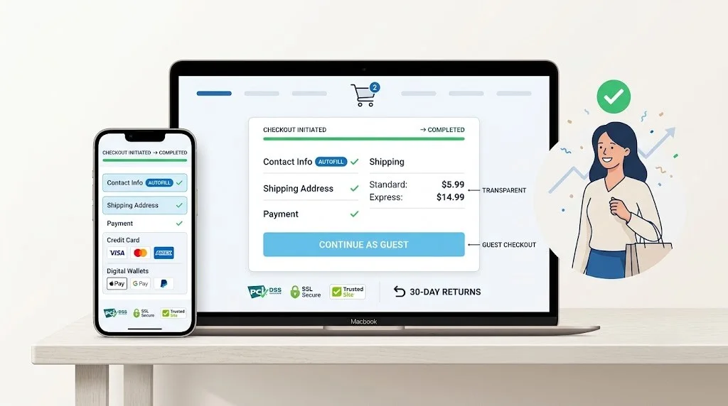
Locate the cart in the upper-right area of every page. This is the position that online shoppers have been trained to expect by years of convention. Each time a product is added, the icon should immediately display the updated item count and running subtotal.
When clicked, the cart should reveal its contents without forcing a page change. A compact overlay or slide-out drawer gives shoppers a quick snapshot of what they have selected. They can verify their order and move to checkout smoothly.
Offer Guest Checkout Without Caveats
Mandatory registration is one of the most reliably effective ways to lose a sale. Customers increasingly view forced account creation as an unnecessary intrusion, particularly for single or infrequent purchases.
Present guest checkout as the most visually dominant option on the login screen. You can collect an email address for order-related communications without requiring a password or full profile. The path to purchase should feel fast and unencumbered.
Post-purchase is the appropriate moment to suggest account creation. The customer has already experienced your store's value and may welcome the convenience of a saved profile. A small incentive for registering can be effective, but it must never stand between the buyer and their purchase.
Expose Every Cost Before the Final Step
Unexpected fees at checkout are one of the most frequently documented causes of cart abandonment. The psychological impact of watching a total inflate at the last moment — a sense of being misled — is difficult to overcome.
Communicate shipping costs as early as the product page. When free shipping is available, make that fact highly visible. If charges depend on the customer's location, provide a postal code calculator within the cart so they can see an accurate estimate before proceeding to checkout.
Tax information should receive the same early treatment. Revealing it only at the confirmation screen breeds resentment. A web design company experienced in e-commerce understands that pricing transparency throughout the entire funnel is not merely good practice — it directly impacts conversion rates and customer retention.
Make Checkout Forms as Short as Possible
Every additional field in a checkout form functions as a small barrier between the customer and the completed sale. Cumulatively, even seemingly trivial questions can create enough friction to drive abandonment.
Collect only the information strictly required for order fulfilment: shipping address, billing details, and payment method. Questions about phone numbers, referral sources, or personal preferences do not belong in the checkout flow.
Smart implementation choices reduce the perceived effort of completing the form. Address autocomplete, auto-populated city and state fields based on a postal code, and dropdown selections where appropriate all cut down on manual typing. A Singapore web designer who has worked extensively on e-commerce projects understands that these small technical adjustments have an outsized impact on form completion rates.
Deliver Instant, Constructive Error Feedback
A checkout form that waits until final submission to report errors creates an experience that feels punitive. Customers who have filled out every field only to be told something went wrong are likely to leave rather than search for the problem.
Real-time validation catches errors at the moment they happen. A misspelled email triggers an immediate notification. A blank required field is highlighted as the customer attempts to move past it. The messages should identify the specific issue and clearly explain how to correct it.
Browser autocomplete works alongside validation to prevent mistakes before they occur. When saved names, addresses, and payment details populate with minimal effort, the opportunity for typing errors shrinks considerably. This pairing creates a checkout that feels helpful and responsive rather than error-prone.
Accommodate a Range of Payment Preferences
Credit and debit cards are no longer the universal default. Digital wallets, deferred payment services, and alternative methods have reshaped how consumers prefer to pay.
Supporting options like Apple Pay, Google Pay, PayPal, Klarna, and Afterpay demonstrates that your checkout is designed for how people actually transact today. Digital wallets are particularly valuable for mobile shoppers, where they reduce the payment step to a single authenticated tap.
Your analytics data reveals which methods and devices are most relevant to your particular audience. If mobile devices account for a substantial share of traffic, wallet integration shifts from a nice-to-have to a necessity. Eliminating the need to type a full card number on a small keyboard is one of the highest-impact changes a store can make.
Use Trust Signals to Reinforce Credibility
Sharing payment information online requires a level of confidence that the transaction is secure. Your checkout page must project that security through deliberate, visible design elements.
Place security badges, SSL indicators, and payment processor logos directly beside the payment form. These signals address customer concerns at the precise moment when those concerns are most active. Guarantee icons add another layer of reassurance.
The checkout's visual design should also remain consistent with the broader site. A sudden stylistic shift or a redirect to an unfamiliar URL can trigger suspicion. Maintaining your brand's colours, typography, and layout throughout the entire transaction preserves the trust you have already established. A web design company that pays attention to these transitions ensures the customer's confidence is sustained without interruption.
Use Email to Recover Abandoned Carts
Some abandonment occurs for reasons entirely outside the scope of design. A customer's phone runs out of battery. A meeting begins unexpectedly. A moment of hesitation passes into distraction. These scenarios cannot be prevented through interface improvements.
Automated email sequences triggered by abandoned carts provide a practical recovery mechanism. This feature is built into virtually every major e-commerce platform and requires minimal setup.
The recovery message should be clean and focused on action. Show the abandoned product with a clear image and include a direct link that restores the cart to its exact previous state. A modest incentive — free shipping or a small discount — can be effective in prompting completion. Deploy these offers selectively, though. Habitual discounting conditions shoppers to abandon on purpose as a strategy for accessing deals.
Make Return Policies Visible and Simple
Ambiguity around returns creates hesitation at the worst possible moment in the buying journey. Customers who cannot easily verify that returns are manageable will frequently choose not to purchase rather than risk the uncertainty.
Surface return information in locations that shoppers naturally visit: the product page, the cart, and the site footer. Where the policy appears matters as much as what it contains.
Express the terms in straightforward language. "Free 30-day returns" communicates value and confidence far more effectively than a dense block of legal conditions. When buyers understand that reversing a purchase is simple, their willingness to commit increases meaningfully. This is a detail that a Singapore web designer focused on conversion optimisation will weave into the site architecture deliberately.
Recognise When Professional Support Adds Value
Fixing checkout problems requires a blend of skills that does not often come bundled in a single individual: understanding of consumer behaviour, technical implementation expertise, and design sensibility.
A qualified professional can audit your checkout flow comprehensively and pinpoint the exact stages where customers disengage. They bring knowledge of form design, payment integration, mobile responsiveness, and performance testing that goes well beyond surface-level adjustments.
For new ventures, collaborating with a web design company from the project's inception ensures that the checkout infrastructure is constructed on solid technical foundations. Server configuration, security certificates, and payment gateway integration all require careful, precise work from day one. Getting these elements right early prevents expensive corrections down the road and allows you to concentrate on operations and growth.
Closing Perspective
Cart abandonment can be reduced significantly, but it cannot be eliminated entirely. Some drop-off is inherent to online commerce, regardless of how well a store is designed.
What strong design accomplishes is narrowing the gap between browse and buy. Accessible cart placement, guest checkout, transparent pricing, and concise forms address the most common friction points. Layering in diverse payment options, visible trust indicators, and automated recovery strategies reinforces the overall experience.
Every unnecessary obstacle removed from the checkout path contributes to a higher conversion rate. Test your store on a mobile device, observe how real customers interact with the checkout, and systematically address friction wherever it exists. A checkout experience crafted with intention and precision remains the most reliable tool for converting browsers into committed buyers.