 Sign up with Google
 Sign in with Zoho
I could still recognise the market lane in the illustration. The narrow gap above the shade cloth and the row of wooden posts were right where I expected them. Then I looked at the sign over the doorway. The board was still there, but the painted strokes had been redrawn. I could use the illustration to evoke the place, and I would go back to the photograph if I needed to read the sign exactly.
I was working from a photograph of a market lane in Dubai by Saugat Shrestha, published on Pexels. I wanted a softer illustration for a travel-style story. The photograph is quiet and mostly empty, with a line of timber posts leading past a stone storefront. That gave me a specific choice to make. I could simplify the surfaces and shadows, but the layout had to remain familiar enough that someone looking at the two images would see the same lane.
Pick the details that place you on the street
Before opening the editor, I picked three landmarks I could find again in the finished image. The first was the overlapping shade sails. They cover most of the top half of the photo, and the gaps between them give the sky a particular shape. The second was the line of wooden posts receding to the left. Their rough edges could become ink marks, but their positions needed to keep the same path through the scene.
The third was the storefront on the right. Two stone columns, the dark hanging lamp and the blue-green door make that side of the lane easy to spot. There is also a drain grate in the foreground. I kept it as a secondary checkpoint because it sits low in the frame and gives me something to compare if the foreground starts to feel different.
Ask for a different surface and the same view
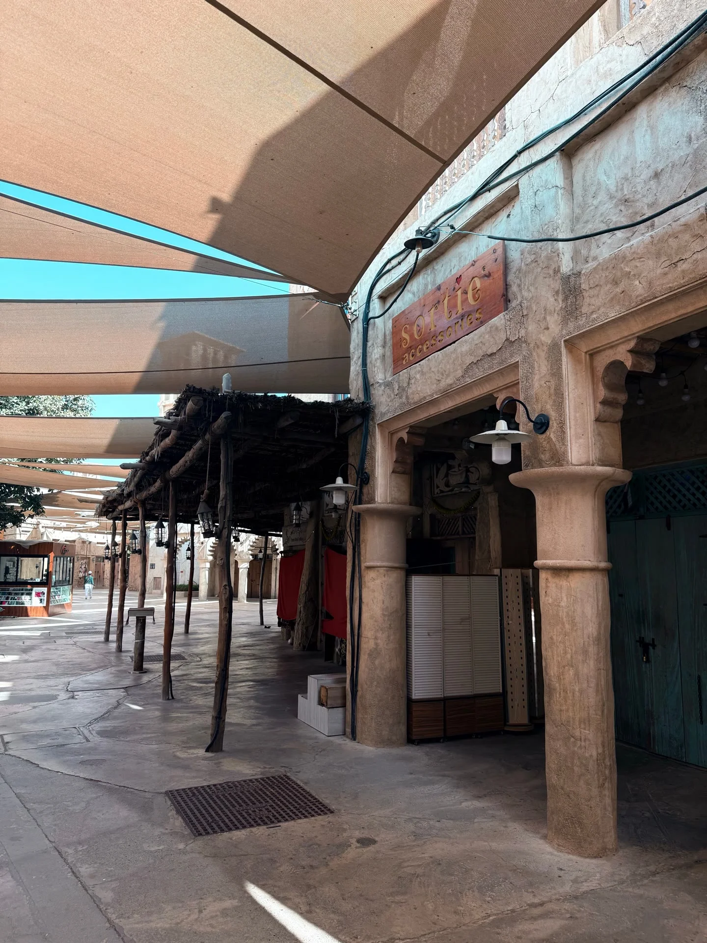
I resized the photograph to a 1440 × 1920 JPEG without cropping and uploaded it to the Image editing workspace in Grok Image 2.0. I used Standard quality and the source-based resolution. The downloaded result was 1776 × 2368, with the same portrait proportions.
I asked for transparent watercolor washes and fine sepia outlines. Then I named the shade sails, the receding line of posts and the stone storefront, including the lamp and the sign above the entrance. I asked the editor to keep the viewpoint and crop, and to simplify small textures and lettering. The quiet lane was already part of the image I wanted, so I also asked it to leave out any new shoppers or displays.
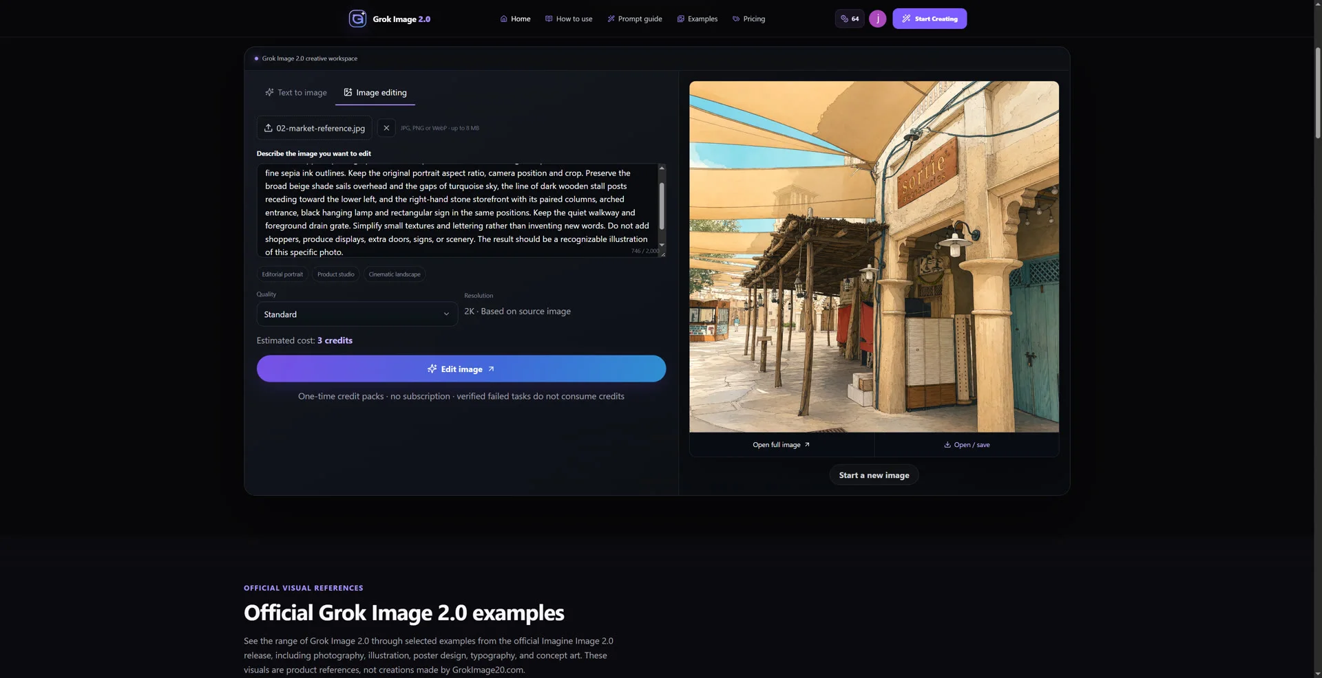
Giving the style and the landmarks separate instructions helped me judge the result. I could look at the paper-like color and ink edges as one set of changes, and then check the three places I had marked in the photo. I kept the original upload beside the output for that second pass. The lamp was my quickest checkpoint because it is small, dark and easy to locate against the stone wall.
Follow the lane through both images
I opened the two images at 600 × 800 with their full frames visible. At that size, the largest change was the light. The original shade cloth has a cooler, deeper shadow. The illustration turns it into broad golden washes. The walls and paving are lighter too, and the strongest shadows are less distinct. The scene feels warmer even where the objects have stayed in roughly the same places.
The turquoise gap above the lane is still there. Beneath it, the line of posts takes the eye from the lower middle of the image towards the open lane at left. On the right, the hanging lamp still sits above the stone column, beside the darker entrance and blue-green door. I can trace a similar route through both pictures with my eye. Those relationships are what make the result recognisable to me.
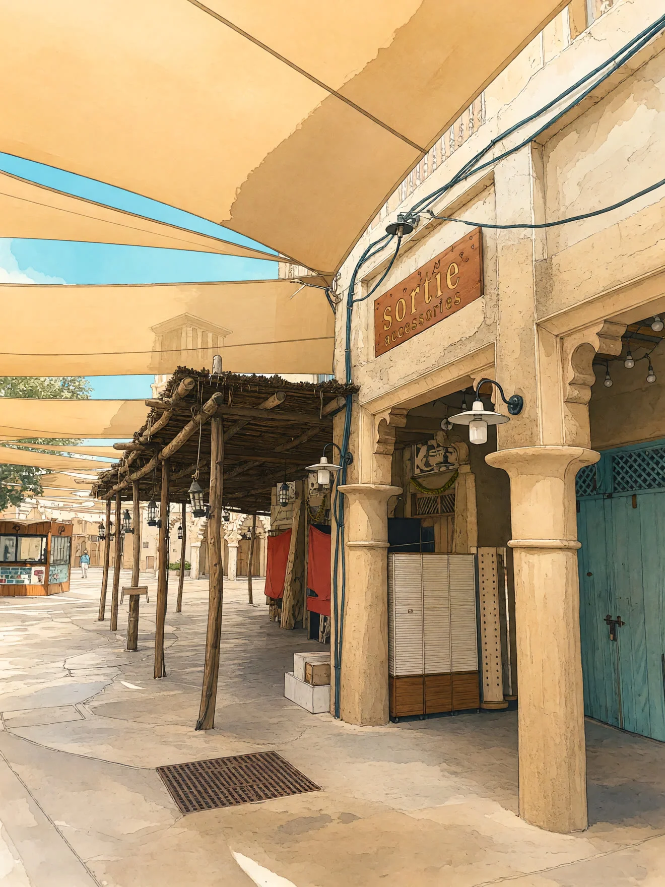
The rectangular sign is still in the expected place, and some lettering is legible, but the shapes of the strokes differ from the photo. That is easy to miss while following the posts and the line of the roof. The shaded area beneath the timber roof is also more open and detailed in the illustration. Both areas are worth checking if the image will be used to identify a shop or explain a feature of the building.
Give the illustration a job it can do
I would use this version to open a story about the feeling of a shaded market lane. The warm wash makes the scene inviting, and the canopy, posts and doorway give readers something specific to look at. I would put the photograph beside it or include it later in the story if the location itself were important to the reader.
For another street image, I would pick landmarks at three different distances before editing. One might sit above the street, one might lead into the background, and one might be close enough to recognise at a glance. Then I would compare the edit at the size it will appear on the page. Here, that meant looking for the gap in the canopy, following the timber posts and stopping at the lamp by the door.