 Sign up with Google
 Sign in with Zoho

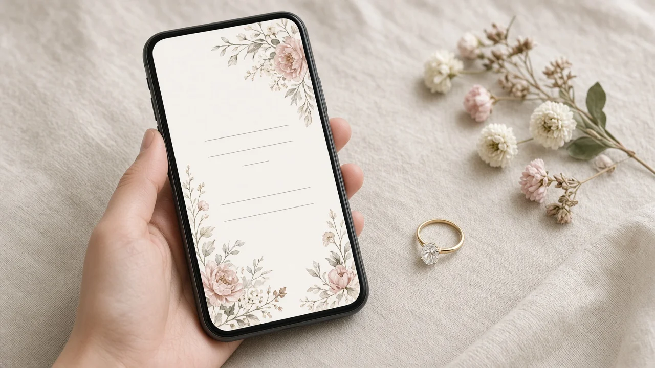
When we got engaged, I assumed we'd send printed save-the-date cards like everyone else. Then I counted how many of our guests live abroad. Almost half. Posting cards to four countries felt slow and expensive, and I knew most of them would end up reading it on their phones anyway.
So I made a short video instead. My first version ran 45 seconds and had our names fading in so slowly that you'd scroll past before seeing the date. The second one worked. Here's what I learned in between.
What has to be in it
A save-the-date has one job: get the date into people's calendars. Everything else is decoration. Before you open any app, write down:
- Both names
- The date
- The city (the venue can wait)
- "Formal invitation to follow", so nobody books flights off a teaser
A few rules made a big difference for me:
- Nothing that needs pausing. If someone has to freeze the video to read the date, it's on screen for too short a time. Give text at least three seconds.
- Vertical. People will watch it in WhatsApp or on Instagram, phone in hand.
- 15 to 30 seconds. Shorter feels abrupt, longer gets skipped. 20 seconds is a sweet spot.
- Music that matches. Soft and simple usually works better than something dramatic.
Way 1: a phone photo slideshow with music
Pick five or six engagement photos, open your phone's photo app or any basic editor, set each photo to about three seconds, and add a song. Put the names and date on the last photo.
Best for: couples who want something today and have good photos already.
Way 2: a template where you only change the text
Design apps have save-the-date video templates in vertical format. You swap in your names, date and city and maybe one photo. The layout and animation are already done.
Best for: anyone who wants it to look polished and doesn't mind that other couples might use the same template.
Way 3: Live Photos or a short burst, stitched together
If you took Live Photos or bursts during the engagement shoot or on your own, those few seconds of real movement (a laugh, a turn, the ring catching the light) can be strung together into something warmer than stills.
Best for: couples with lots of candid phone shots.
Way 4: a photo-to-card transition
This is the one I ended up using. The idea: start on an engagement photo and end on the save-the-date card itself, with the image moving smoothly from one to the other.
I made mine with an image-to-video model that supports a photo-to-card transition with a first and last frame. On Videoify's MiniMax H3 page, the first frame is required and the last frame is optional; giving it both gives the shot a clearer path. I used our engagement photo on the beach as the first frame, a plain card design with soft flowers as the last frame, and asked for one slow camera push-in.
What I'd pass on:
- Keep it short. Clips run 4 to 15 seconds. Mine was six, and I built the rest of the video around it.
- Check the cost first. It's credit-based (2 credits per second at 768P, 3 at 2K), and the cost is shown before you submit.
- Don't ask it to write your names. Generated text often comes out misspelled. I left the card blank in the last frame and added names and the date afterwards in a regular editor, where they stay crisp.
- Make two or three takes. Results vary between runs, so compare a few and pick the calmest one.
Best for: couples who want one memorable moment and don't mind a bit of trial and error.
Before you send it
- Ask your photographer. Engagement photos often come with usage terms. A quick message asking whether you can use them in a video like this saves an awkward conversation later.
- Watch it on a phone with the sound off. Many people will open it on mute. The names and date have to work without audio.
- Send a test to one person first. I sent mine to myself on a different app to check the compression and the crop. One app cut the top of the frame, so I moved the text lower.
What I'd do differently
I'd decide the length before choosing music. I picked a song I loved, then tried to stretch the video to fit it, which is how I got to 45 seconds. Starting from "20 seconds, date visible by second 12" would have saved me an evening.
How long should it be? 15 to 30 seconds. Around 20 is easy to watch in full.
Vertical or square? Vertical, for phones. Square only if you mainly post to a grid.
What about music rights? Use music from the app's licensed library, or something you have permission to use, especially if the video will be posted publicly.