 Sign up with Google
 Sign in with Zoho

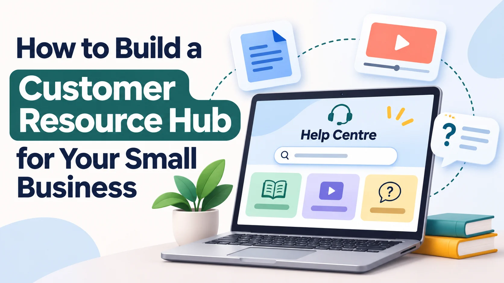
Customers often need a little guidance before they feel ready to buy, book, or use a product. They may want to understand delivery, find a setup instruction, or check what happens after placing an order.
When those answers are scattered across old posts and messages, finding them can become frustrating.
A customer resource hub brings useful explanations into one organised place on your website. It can include guides, short demonstrations, checklists, and answers to common questions.
You can begin with a few pages that address real needs, then expand as you learn what customers find useful.
1. Give Your Hub a Clear Purpose
Decide what your first version should help people accomplish. A retailer might focus on ordering and product care. A service business might explain preparation, appointments, and what customers can expect afterwards.
Write a simple purpose statement, such as: “Help new customers place an order and understand the next steps.”
This statement gives you a way to judge potential additions. Content belongs in the hub when it helps someone complete a relevant task or make an informed decision.
Keep promotional claims separate from instructions where possible. Readers looking for help should quickly find the information they came for.
2. Collect Questions From Real Conversations
Review recent enquiries, support messages, comments, and sales conversations. Write down the questions people ask in their own words.
Group similar questions together. “Where is my parcel?” and “How do I check delivery progress?” may belong in one guide, while changing an address may require a separate explanation.
Give priority to questions that appear repeatedly, cause confusion, or prevent someone from completing a task.
Ask colleagues what they explain most often. Someone handling orders or answering calls may notice problems that never appear in your marketing reports.
Use these observations to create your initial content list.
3. Organise Content Around Customer Tasks
Choose category names that describe what people need to do. Labels such as “Place an order,” “Get started,” and “Care for your product” give visitors an understandable starting point.
Keep the structure shallow enough that important answers are easy to reach. A small hub may only need a landing page, several categories, and individual guides.
Give every guide a descriptive title. “How to find your order confirmation” is more useful than a vague heading such as “Important information.”
Add links between genuinely related pages. A delivery guide, for example, could point readers to instructions for checking an order.
Make the hub visible when customers need it. Link to relevant guides from confirmation emails, product pages, and support replies. Use specific link text that explains the destination. Someone reading about delivery should reach the delivery guide directly without having to browse the entire hub.
4. Write Guides That Work Independently
Assume someone may arrive directly from a search result, email, or shared link. Each guide needs enough context to make sense on its own.
Begin by explaining what the reader will accomplish. Mention anything they need before starting, such as an order reference or access to their account.
Present instructions in a logical sequence, with one main action per step. Describe what readers should see after completing an action.
Explain unfamiliar terms when they first appear. If the process has different paths, state clearly which instructions apply to which situation.
Finish with an appropriate next step or support route.
Use short paragraphs, descriptive headings, and readable text sizes. Describe meaningful images with appropriate alternative text, and provide captions or a transcript when spoken instructions carry essential information. These choices give readers more than one way to access the explanation at their own pace.
5. Add Visuals Where They Clarify an Action
A screenshot can show where a control appears. A short recording can demonstrate how a process unfolds. Choose the format that makes a specific instruction easier to follow.
For example, a guide about checking an order might benefit from a brief demonstration of finding the relevant section in an account.
If an animated clip suits that explanation, you can explore VideoToGIF for your video to GIF project.
Check the result on a phone as well as a larger screen. Small interface details should remain readable, and essential instructions should also appear in text.
Use sample information in demonstrations and review the file before publishing.
6. Choose Tools Within a Defined Budget
List the functions your hub needs before comparing software. Your existing website may already support articles, categories, images, and a contact form.
Start by identifying the gaps. You might need better navigation, a recording tool, or a simple way to collect feedback.
Separate essential requirements from convenient extras. This helps you compare options against an actual task.
When exploring possible purchases, you can include DealFlick in your research for potential offers. Check the seller’s current pricing, renewal charges, usage limits, and cancellation terms directly.
Record what each purchase contributes to the hub. Review recurring costs periodically so your spending stays connected to tools you still use.
7. Make Human Help Easy to Find
A resource hub should give customers a clear route to further help when the published explanation does not resolve their question.
Add a relevant contact option near the end of each guide. Explain what information customers should provide so your team can understand the issue.
For an order question, that might include an order reference and a short description of what happened. Avoid requesting details that are unnecessary for resolving the problem.
Set expectations you can maintain. If you publish response hours or a typical reply time, check that they reflect your actual availability.
8. Keep Instructions Accurate
Assign someone to review the hub and update it when your processes change. An outdated screenshot or missing step can make a simple task harder.
Keep the original recordings, written instructions, and published links in an organised folder or content register.
Record a review date for each guide, along with the person responsible for checking it. Give frequently changing instructions more attention than stable background information.
When updating a process, review related pages and messages too. A corrected website guide is less helpful if customers still receive an email containing the old instructions.
9. Measure Where Customers Need More Help
Look at the questions people ask after using the hub. Repeated confusion can reveal missing information, unclear wording, or an instruction that needs a visual.
If your website supports relevant reporting, review which guides visitors use and where they continue afterwards. Interpret the data alongside customer feedback.
A frequently visited page may be useful, but it may also cover a process that causes repeated difficulty.
Ask a simple feedback question, such as whether the guide helped someone complete their task. Use responses to decide which explanations deserve improvement.
Publish a Useful First Version
Choose five common questions, organise them around customer tasks, and write clear answers. Add visuals where they improve understanding and a contact route where further help may be needed.
Check the pages on different screens, test every link, and ask someone unfamiliar with the process to follow the instructions.
Expand the hub as real questions reveal what is missing. With regular attention, it can become a practical reference that supports customers throughout their relationship with your business.