 Sign up with Google
 Sign in with Zoho

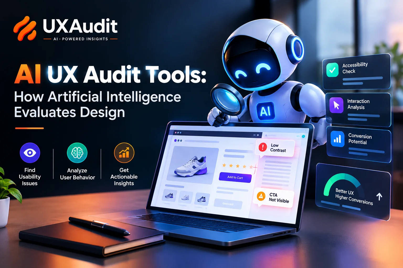
AI UX audit tool looks at websites or applications, compares them with usability criteria and behavioral data, and points out where actual users will most probably get stuck.
Think of it as a very fast first pass at a UX design audit. Fast is the keyword. Complete is not.
I learned that distinction on a project that still makes me wince.
A SaaS client came to us because trial sign-ups had flatlined. Their team had redesigned onboarding twice in six months, and both times the numbers barely twitched.
We ran the flow through an AI audit tool on a slow Tuesday afternoon. Within an hour, it had flagged three things:
- A low-contrast primary button
- A form field that broke on mobile Safari
- A pricing toggle almost nobody noticed
Our designers weren't surprised by any of it once they saw it.
They just hadn't looked. Nobody had.
How AI UX Audit Tools Evaluate Design
Most executives I talk to assume these tools "look" at a page the way a person does. They don't. They run three narrow checks at once and stitch the results together.
Layer 1: Rules-based checks
The tool compares your interface against usability heuristics, such as Jakob Nielsen's ten principles, and accessibility standards like WCAG. Typical catches include:
- Body text below the 4.5:1 contrast ratio WCAG recommends
- Icon buttons with no label for screen readers
- Navigation patterns that change from page to page
Boring stuff. Also the stuff that quietly costs you customers.
Layer 2: Attention prediction
Attention models, trained on eye-tracking studies, estimate where a visitor's gaze lands in the first few seconds.
I've watched one of these heatmaps light up a stock photo of a smiling team while the "Book a demo" button sat in a cold blue patch. The client had spent weeks debating button copy. Nobody could even see the button.
Layer 3: Behavioural analysis
Connect the tool to your analytics or session recordings, and it clusters patterns a human would need days to spot:
- Rage clicks on a disabled field
- Users bouncing between two pricing tiers
- Scroll depth collapsing right before your strongest proof point
Put those three layers inside one AI UX audit tool, and you get a user experience audit that's broad, quick, and repeatable. You can run it every sprint without booking a single meeting.
Where AI UX Audits Fall Short (Including Free Tools)
Here's the part vendors tend to skip.
1. It doesn't understand your business
On one audit, a tool flagged a dense data table in a B2B analytics dashboard as "high cognitive load" and suggested hiding half the columns. For a consumer app, fair enough. For finance analysts who live in that screen eight hours a day, it would have been a disaster. They'd asked for more density, not less.
Lesson learned: treat every AI flag as a hypothesis, not a verdict. The tool is excellent at saying "something looks off here." It's weaker at saying why, and weaker still at weighing a fix against what your users actually value.
2. Free tools only go so far
Free ux audit tools are great for triaging a single landing page before a campaign goes live. But most free ai ux audit options share the same limits:
- They scan one URL at a time
- They ignore logged-in states
- They return generic advice like "reduce clutter"
Useful for spotting smoke. Not much help finding the fire.
3. It can't read emotion
An AI can tell you a checkout form has eleven fields. It can't tell you that asking for a phone number at step two makes enterprise buyers nervous about a sales call they didn't request.
How to Run a Website UX Audit with AI: A 6-Step Process
The teams that get real value from these tools don't just press "scan" and forward the PDF. Here's the process we use for a website ux audit:
- Pick three journeys that make money. Sign-up, checkout, demo request. Skip the About page for now.
- Capture a baseline first. Screenshot every step and note current conversion rates. Without this, you'll never prove the fixes worked.
- Run the AI scan across desktop and mobile. Start the audit on each journey separately, and include logged-in states if the tool supports them.
- Sort flags by revenue impact, then effort. A broken mobile form field beats a slightly awkward font pairing every time.
- Validate the top five with real people. The old rule of thumb says five users will surface the most major usability problems. In my experience, that holds up well for a focused journey.
- Fix, re-scan, compare. Same pages, same devices, two weeks later.
Pro tip: scan staging, not production
Run the scan on staging before every major release. Catching a contrast failure there costs you ten minutes. Catching it after a paid campaign has sent 20,000 visitors to the page costs a lot more.
When to bring in UX audit services
The tool stops being enough once your audit keeps surfacing structural problems, such as:
- Navigation that confuses users across the whole product
- A product that's grown three features too many
- Findings that point to a redesign rather than a quick fix
That's when it makes sense to bring in ux audit services from a team that can connect findings to a redesign plan, whether that's a focused sprint or a full web app design overhaul.
AI gives you the map. People still have to decide where to build the road. A good ux design audit blends both.
Can AI Replace a Human UX Design Audit?
Every AI audit I've run has told me something true about a design. Very few have told me something important. It is within this space that the work remains to be done, and the future generation of such technologies can earn their value or simply disappear.
If one of your core journeys has been nagging at you for a while, it's worth talking it through with an audit specialist before you commit to another redesign.
So here's what I'm curious about: the last time an AI tool flagged a problem in your product, did you fix it because the data convinced you, or because you'd already suspected it and finally had permission to act?