 Sign up with Google
 Sign in with Zoho

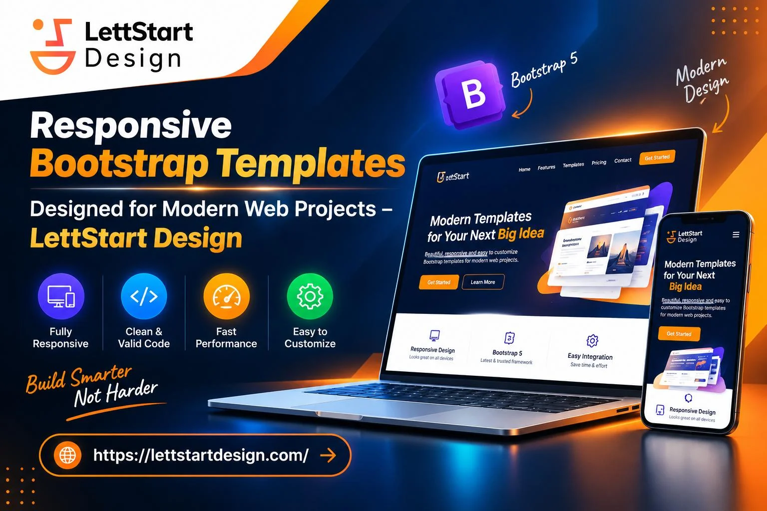
Open your website on your phone. Go ahead, I'll wait. Does the menu fit on the screen? Can you tap a button without hitting the wrong one? Do you have to pinch and zoom just to read a paragraph?
If any of that felt clumsy, your visitors feel it too, and most of them won't stick around to tell you. People browse on phones, tablets, laptops, and desktops, often switching between them in the same day. A site that only looks good on one screen quietly turns the rest away. This is where Bootstrap templates earn their keep.
What "responsive" actually means
A responsive website adjusts its layout to fit whatever screen it's shown on. Instead of building one version for desktop and another for mobile, you build a single site that rearranges itself. Three columns on a wide monitor become one stacked column on a phone. Images shrink instead of spilling off the edge. The navigation folds into a neat menu button.
Bootstrap, the popular open-source front-end framework, handles this with a 12-column grid and a set of breakpoints, which are the screen widths where the layout shifts. Good Bootstrap templates are built on that system, so the responsive behavior is already in place before you touch a single line of code.
How it improves the experience for real visitors
Text that's easy to read
Tiny fonts and endless lines of text are the quickest way to frustrate someone on a small screen. Responsive templates scale type and spacing so paragraphs stay comfortable, whether the visitor is on a 27-inch monitor or a five-inch phone. No sideways scrolling, no zooming.
Navigation people can actually use
Thumbs are bigger than mouse cursors. Bootstrap's collapsible navbar and generously sized buttons are designed with touch in mind, so tapping a link feels natural. Visitors find what they came for faster, and that usually means more of them call you, book, or buy.
A consistent look everywhere
When your site feels the same on every device, people trust it more. Fonts, colors, buttons, and forms follow the same rules, so nothing looks broken or half-finished. Customers notice that, even if they couldn't tell you why.
Lighter, quicker pages
Bootstrap's components are widely tested, so pages built from them tend to be cleaner than something stitched together from scratch. Flexible images and lean layouts help pages load faster on slow mobile connections, and speed has a huge effect on whether someone stays or leaves.
A head start on accessibility
Many Bootstrap components come with sensible defaults for keyboard navigation and screen readers. It doesn't replace proper accessibility testing, but it gives you a solid base that helps everyone, including people who rely on assistive technology.
Why business owners and beginners like them
You don't need a big design budget or a developer on retainer. Ready-made Bootstrap templates come with layouts for landing pages, portfolios, online stores, and dashboards. Swap in your logo, colors, and copy, and you can have something professional live far sooner than building from zero. Developers benefit too: less repetitive work, more consistent projects, and more time for the parts that make a site unique.
There's an SEO upside as well. Search engines favor sites that work well on mobile, so a responsive layout supports your visibility on top of making visitors happier.
What to look for before you pick one
• Test the live demo on your own phone, not just a desktop browser.
• Check the Bootstrap version. A template on a recent release with regular updates is safer long term.
• Watch for bloat. Heavy sliders and animations can undo the speed benefits.
• Look at the code quality if you plan to customize. Clean, well-commented files save hours.
• Read the license, especially for client or commercial projects.
Final thoughts
Your visitors will never think about breakpoints or grids. They'll only notice whether your site feels easy or annoying. Responsive Bootstrap templates take care of the hard layout work, so the experience stays smooth from phone to desktop. Pick one that fits your content, test it on a few real devices, and fix the rough edges. That small bit of effort pays off every time someone opens your site on the go.