
 Sign up with Google
 Sign in with Zoho

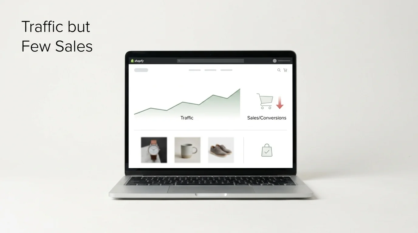
Why Some Shopify Stores Get Traffic but Few Sales
Getting visitors to a Shopify store is only one part of selling online. A store can receive hundreds or thousands of visits and still make very few sales.
This often happens when the people who visit the store do not find enough reasons to buy. They may come from search engines, social media, ads, or referrals. Yet something can stop them before checkout.
The problem may be the product page, price, shipping details, checkout process, mobile layout, product photos, or even the type of visitors reaching the store.
This article explains why Shopify stores can get traffic but few sales and what businesses should check.
Traffic Does Not Always Mean Sales
Website traffic shows how many people visit a store. Sales show how many visitors become customers.
These are two different numbers.
For example:
All three stores receive the same number of visitors. Their sales are very different.
This shows an important point:
More traffic does not always create more orders.
The quality of traffic and the shopping experience also matter.
1. The Store May Attract the Wrong Visitors
One of the biggest reasons for low sales is poor traffic targeting.
Imagine a store sells high-end running shoes. The store may rank for searches about free running shoes, cheap shoes, shoe pictures, or running tips.
People may visit the site because they want information. They may not be ready to buy.
Search Intent Matters
A store needs traffic from people who are interested in its products.
If most visitors are only looking for information, sales may remain low even when traffic keeps growing.
2. Product Pages May Not Answer Buyer Questions
A product page should give shoppers the information they need before buying.
Visitors often want to know:
- What does the product do?
- What size should I choose?
- What materials are used?
- How much does shipping cost?
- When will the order arrive?
- Can I return it?
- What makes this product different?
- What comes with the product?
If these answers are missing, visitors may leave.
A Product Page Should Cover
The goal is not to fill the page with text. The goal is to answer real buyer questions.
3. Product Photos May Not Show Enough
Online shoppers cannot touch or hold a product.
Photos have to do much of that work.
Poor images can create doubt.
A shopper may leave if:
- The image is too small.
- Only one angle is shown.
- The product is hard to see.
- There is no close-up image.
- The product size is unclear.
- The photos do not match the product description.
For clothing, photos can show the item being worn. For furniture, photos can show the product inside a room. For electronics, images can show ports, controls, size, and included parts.
The type of image should match the product.
4. The Product Description May Be Too Weak
A product description should explain the product in language shoppers can understand.
A weak description may only list basic information.
For example:
Cotton shirt. Blue color. Available in several sizes.
This tells the shopper very little.
A stronger description can explain:
- Fabric type
- Fit
- Available sizes
- Care instructions
- Main features
- Suitable use
- What comes in the package
The description should help the shopper decide if the product fits their needs.
5. The Price May Create Doubt
Low sales do not always mean the price is too high.
The issue may be that shoppers do not understand what they are getting for the price.
A $100 product may seem expensive when the page gives little information.
The same price may seem reasonable when the page clearly explains:
- Product quality
- Materials
- Size
- Included items
- Warranty
- Shipping
- Return terms
Price should be viewed along with the information shown on the product page.
6. Shipping Costs Can Stop a Sale
Unexpected shipping costs are a common reason for cart abandonment.
A shopper may see a product for $40. They add it to the cart and then discover a $15 shipping charge.
The final amount is now $55.
That change can affect the purchase decision.
Show Shipping Information Clearly
Businesses should make key shipping details clear before checkout.
Clear shipping information can reduce uncertainty during the buying process.
7. The Mobile Shopping Experience May Be Poor
A large share of online shopping happens on mobile devices.
A Shopify store may look good on a desktop but work poorly on a phone.
Common mobile problems include:
- Tiny text
- Small buttons
- Images that load poorly
- Menus that are hard to use
- Product options that are difficult to select
- Pop-ups covering the page
- Slow page loading
- Checkout fields that take too much effort
A business should test the full buying process on different screen sizes.
Do not only check the homepage.
Open a product page, add an item to the cart, and complete the checkout process.
8. Too Many Pop-Ups Can Distract Shoppers
Pop-ups can be useful for email signups, discount codes, or announcements.
But too many pop-ups can interrupt shopping.
For example, a visitor may see:
- Email signup pop-up
- Discount pop-up
- Cookie notice
- Chat window
- Exit-intent offer
The shopper may spend more time closing boxes than viewing products.
A store should check whether each pop-up has a clear purpose.
If a pop-up does not help the shopper or the business, it may not need to appear.
9. The Checkout Process May Have Too Many Steps
A shopper can decide to buy and still leave during checkout.
This can happen when checkout asks for too much information or creates confusion.
Watch for Problems Such As
- Too many fields
- Unclear shipping options
- Unexpected charges
- Limited payment methods
- Account creation required
- Confusing error messages
- Poor mobile layout
The checkout should collect the information needed to complete the order without adding unnecessary steps.
10. Customers May Not Trust the Store Yet
Trust plays an important role in online shopping.
A new visitor may ask:
Can I trust this store with my money?
The store can answer this question through clear information.
Useful trust signals include:
- Real customer reviews
- Clear contact details
- Return policy
- Shipping policy
- Product information
- Company information
- Secure payment options
- Accurate product photos
Trust should come from real information. Businesses should not create fake reviews or false claims.
11. Product Reviews Can Affect Buying Decisions
Reviews give shoppers information from people who already purchased the product.
Reviews can answer questions that a business description may not cover.
For example:
- Is the size accurate?
- How does the material feel?
- Does the product match the photos?
- How long did delivery take?
- How does the product work after use?
Both positive and negative reviews can provide useful information.
A business should monitor reviews and look for repeated concerns.
If many shoppers mention the same problem, the issue may be with the product, description, packaging, or delivery process.
12. The Call to Action May Not Be Clear
A product page should make the next step clear.
Common actions include:
- Add to Cart
- Buy Now
- Choose Size
- Select Color
- Start Subscription
The button should be easy to find.
If a shopper has to search for the purchase button, the page may be creating unnecessary friction.
The same applies to product options.
If a product has five colors and six sizes, the selection area should make the choices clear.
13. Too Many Product Choices Can Cause Confusion
More products do not always lead to more sales.
Imagine a store sells 200 versions of a similar product.
A shopper may not know which one to choose.
A better approach can be to organize products into clear groups.
Example
Instead of:
200 products
Use:
- Running Shoes
- Walking Shoes
- Training Shoes
- Trail Shoes
- Kids Shoes
Then add filters for:
- Size
- Color
- Price
- Brand
- Material
- Use
This helps shoppers narrow down their choices.
14. The Store May Have a Weak Value Message
A visitor should understand what the store sells and who it serves.
The homepage should answer:
What do you sell, and why should I look at these products?
A vague headline can create confusion.
For example:
Welcome to Our Store
This says very little.
A clearer message might explain the product category and target customer.
The same idea applies to collection pages and product pages.
15. Slow Pages Can Hurt the Shopping Journey
Page speed matters because shoppers do not want to wait for every page to load.
Large images, unnecessary apps, heavy scripts, and poorly configured themes can add page weight.
This can affect:
- Product browsing
- Collection pages
- Cart actions
- Checkout
- Mobile shopping
Businesses should test important pages instead of checking only the homepage.
Pages Worth Testing
16. Discounts May Attract the Wrong Buyers
Discounts can bring traffic, but they can also attract people who only want a low price.
For example, a store may run a large discount campaign.
Traffic increases.
But many visitors leave when they see the regular price.
This can create a gap between traffic and sales.
Businesses should track sales from different campaigns instead of judging campaigns only by visitor numbers.
17. The Store May Not Match the Ad
Suppose an advertisement says:
50% Off Men's Winter Jackets
The visitor clicks the ad but lands on a general clothing page.
The visitor now has to search for the product mentioned in the ad.
This creates confusion.
The landing page should match the promise made in the advertisement.
Good Match
Ad: 30% off black running shoes Landing page: Black running shoe collection
Poor Match
Ad: 30% off black running shoes Landing page: General homepage
The closer the match, the less work the visitor has to do.
18. SEO Traffic Needs the Right Landing Pages
Search engine traffic can come from many keywords.
A store should understand which pages attract that traffic.
For example:
If a shopper searches for a specific product but lands on a page that does not show it, the visitor may leave.
SEO should bring people to pages that match their search.
19. Track Where Visitors Leave
Businesses should not guess where the problem is.
Analytics can show where visitors stop.
A basic shopping path looks like this:
Traffic → Product View → Add to Cart → Checkout → Purchase
Suppose a store gets:
- 20,000 visitors
- 5,000 product views
- 600 add-to-cart actions
- 250 checkouts
- 80 orders
The largest drop may be before the product view.
That points toward traffic quality, homepage content, navigation, or product discovery.
If many users reach checkout but do not purchase, payment, shipping, trust, or checkout issues may deserve closer attention.
Traffic vs Conversion: What Should a Business Check?
This kind of review can help a business find the real issue.
How InovexaTech Can Help With Shopify Store Development
When low sales come from store structure, product presentation, mobile issues, or technical problems, the Shopify setup may need changes rather than more traffic. InovexaTech provides shopify-development services for businesses that need help with Shopify store creation and development. If a business is making a claim about what a service includes, it should first check the actual service scope, project terms, and delivery details.
A Practical Shopify Conversion Checklist
Before spending more money on traffic, check these areas:
Traffic
- Are visitors looking for the products?
- Do ads match the products?
- Do SEO keywords match the landing pages?
Product Pages
- Are product photos clear?
- Is the description useful?
- Are sizes and options clear?
- Is the price easy to see?
- Are shipping and return details shown?
Mobile
- Does the store work well on phones?
- Are buttons large enough?
- Can users select product options?
- Can users complete checkout?
Checkout
- Are there unnecessary fields?
- Are shipping charges shown clearly?
- Are payment choices clear?
- Are error messages understandable?
Trust
- Are real reviews available?
- Are company details easy to find?
- Are policies clear?
- Does the store look consistent?
Final Thoughts
A Shopify store can receive plenty of traffic and still make few sales. The reason is often not a lack of visitors.
The real issue may be who visits, what they see, what they understand, and what happens when they try to buy.
Businesses should review the complete customer journey instead of looking at traffic alone.
Start with the numbers. Find where visitors leave. Then check the page, product information, pricing, shipping, mobile experience, trust signals, and checkout process connected to that point.
More traffic can help when the traffic is relevant. But if visitors keep leaving without buying, fixing the store experience may be more useful than sending even more people to the same pages.
Frequently Asked Questions
1. Why does my Shopify store get traffic but no sales?
The store may attract people who are not ready to buy, or the product pages, pricing, shipping, trust signals, mobile layout, or checkout may create doubts.
2. How can I find where Shopify visitors leave?
Review the customer journey from landing page to product view, cart, checkout, and purchase. Look for the stage where the largest drop occurs.
3. Do more visitors always lead to more Shopify sales?
No. Traffic quality matters. A smaller number of visitors with strong buying intent can produce more orders than a much larger group with little interest in the products.
4. Can product pages affect Shopify sales?
Yes. Product photos, descriptions, prices, product options, reviews, shipping details, and return information can all affect the buying decision.
5. Why do mobile visitors leave without buying?
Possible reasons include small buttons, difficult menus, slow pages, poor product layouts, hard-to-use product options, or a checkout process that does not work well on smaller screens.