 Sign up with Google
 Sign in with Zoho
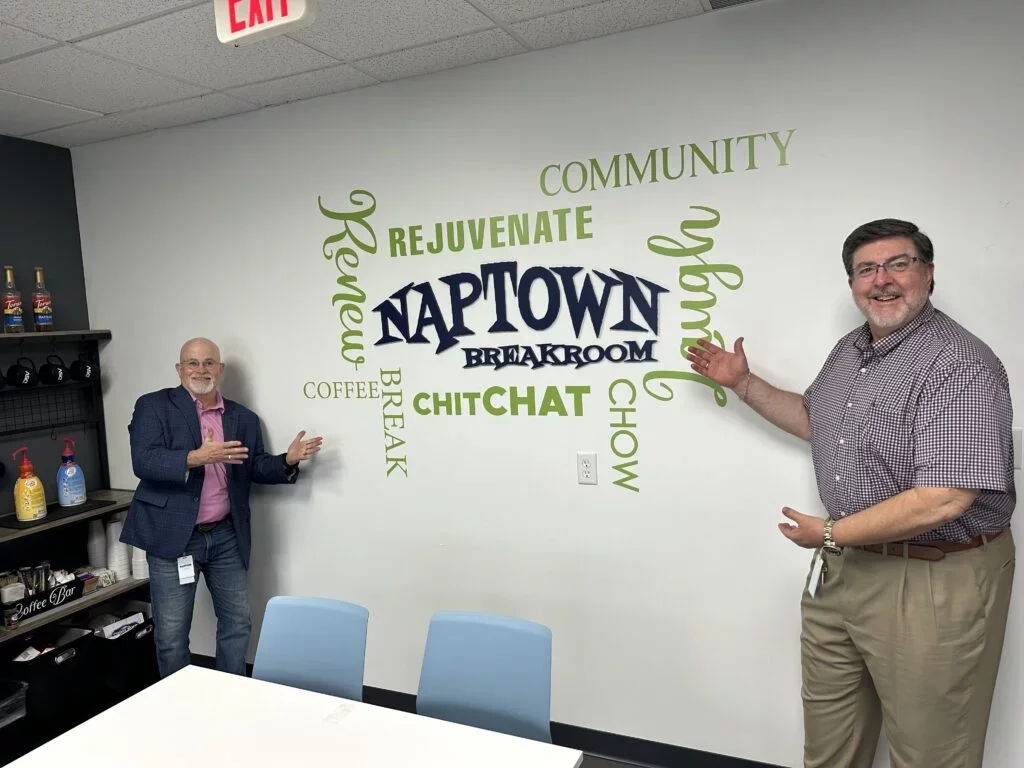
Dimensional lettering is often specified as a visual branding element. From a fabrication perspective, that description is incomplete.
A successful three-dimensional letter system is an assembly of materials, mounting hardware, substrates, tolerances, finishes, and installation conditions. A 1/2-inch acrylic logo installed on drywall behaves very differently from a 3-inch fabricated stainless-steel identity mounted to masonry. Both may look simple on an architectural elevation, but they require completely different fabrication and attachment strategies.
For corporate real estate teams, architects, interior designers, and healthcare facility managers across Central Indiana, dimensional signage should therefore be designed as part of the architectural environment, not ordered as decorative lettering near project completion.
Start With Depth, Not Just Material
The first design decision is often "acrylic or metal?" A better starting point is the visual effect required at the actual viewing distance.
Dimensional letters generally work through three variables:
- Face: what the viewer primarily sees
- Depth: how far the letter projects from the surface
- Shadow: how the installation interacts with ambient light
A 1/2-inch letter can create subtle dimensionality in an executive conference room. A 1-inch to 2-inch system provides stronger architectural presence in a corporate lobby. Deep fabricated letters approaching 3 inches can create substantially greater mass and shadow on large interior walls or exterior façades.
More depth, however, also changes weight, fabrication method, attachment requirements, and visual proportion.
The right specification begins with viewing distance and architectural scale.
Cast Acrylic vs. Router-Cut Acrylic
Acrylic is one of the most versatile materials for Dimensional Letters in Indianapolis because it provides clean edges, controlled color, relatively low weight, and precise CNC fabrication.
Router-Cut Acrylic
For many interior corporate applications, sheet acrylic is CNC-routed into individual letters and logo components.
It performs particularly well for:
- Reception walls
- Conference rooms
- Department identification
- Core value walls
- Branded workplace environments
Common thicknesses can range from relatively thin dimensional elements to 1/2 inch and beyond, depending on the design.
Router-cut acrylic is especially useful when sharp geometry and repeatable letterforms are required. Faces can also receive applied vinyl or specialty finishes where the design calls for an appearance not available in standard acrylic colors.
Cast Acrylic
Cast acrylic is often preferred where optical quality, machining characteristics, dimensional stability, or a premium polished edge is important.
For close-view executive environments, edge quality matters. A polished transparent or translucent acrylic element can become part of the design rather than simply functioning as a substrate.
Acrylic remains relatively lightweight compared with solid metal, making it practical for drywall installations when appropriate anchors, studs, or blocking are available.
Brushed Aluminum: Architectural Appearance Without Excessive Mass
Brushed aluminum is a strong choice when designers want the visual authority of metal without the weight associated with some solid stainless-steel assemblies.
It works well with:
- Contemporary corporate interiors
- Technology offices
- Healthcare administration spaces
- Professional services firms
- Modern exterior façades
Aluminum can be router-cut from plate or fabricated into deeper dimensional forms.
A thin cut-metal letter provides a restrained profile. Fabricated aluminum returns can create substantially greater depth without requiring a solid 2-inch or 3-inch piece of metal.
That distinction matters.
When a design calls for deep lettering, fabricating a hollow metal letter is generally more practical than unnecessarily increasing solid material thickness.
Aluminum can also be painted, anodized, or finished to coordinate with architectural materials.
Stainless Steel: When Finish Quality and Durability Lead
Stainless steel is appropriate where the project requires a premium metal appearance, strong exterior durability, or a highly refined architectural finish.
Brushed stainless steel works particularly well in:
- Executive headquarters
- Financial institutions
- Healthcare environments
- High-end mixed-use developments
- Exterior architectural identification
Its primary tradeoff is weight and fabrication complexity.
Solid stainless components can become heavy quickly as letter size and thickness increase. Larger or deeper systems are therefore commonly fabricated as dimensional shells rather than cut from extremely thick solid stock.
Finish direction also deserves attention.
With brushed metal, grain orientation should be controlled consistently across every letter. Random grain direction can become surprisingly visible under lobby lighting.
HDU: Deep Dimension Without Deep-Metal Weight
High-Density Urethane, commonly called HDU, provides another option where substantial depth is desirable without the weight of solid metal.
HDU can be routed, carved, shaped, primed, and painted.
It is useful for:
- Deep dimensional logos
- Decorative architectural lettering
- Custom profiles
- Certain exterior applications
- Projects requiring carved or sculptural details
Thicknesses of 1 inch, 2 inches, and 3 inches can produce strong dimensional effects without creating the same mass as solid metal.
HDU is not automatically the correct choice for every corporate lobby. Acrylic and metal typically deliver crisper contemporary aesthetics. HDU becomes particularly useful where depth, shape, weight reduction, or specialized fabrication drives the specification.
The Mounting Substrate Changes the Entire Installation
Letters should never be specified independently of the wall receiving them.
Drywall
Drywall is common in corporate lobbies and executive spaces, but the gypsum face itself should not automatically be assumed capable of supporting substantial dimensional assemblies.
For heavier signs, coordinate blocking during construction whenever possible.
Lightweight letters may use appropriate anchors or studs depending on the assembly, but attachment should reflect actual load and wall construction.
Glass
Glass requires a different strategy because conventional drilling may be impossible or inappropriate, particularly with tempered glazing.
Designers may use specialty adhesives, mechanically supported rails, suspended assemblies, or coordinated installations where attachment hardware is incorporated before glazing is finalized.
Adhesive selection must account for transparency. An attachment method that looks acceptable on an opaque wall can become visually unacceptable when viewed through glass from the opposite side.
Metal Panels
Architectural metal panels require knowledge of what exists behind the decorative skin.
The panel itself may not be the structural attachment point.
Fasteners may need to reach secondary framing, and penetrations must be coordinated to avoid distortion, water intrusion, or conflicts with panel-system requirements.
Masonry
Brick, concrete, block, and stone introduce anchor-depth, joint, edge-distance, and surface-irregularity considerations.
Large letters mounted to irregular masonry may require spacers or stand-offs to establish a consistent visual plane.
Stud Mounting: The Workhorse of Dimensional Letter Installation
Stud mounting uses threaded studs projecting from the rear of individual letters into accurately drilled holes in the substrate.
It is one of the cleanest methods because mounting hardware remains largely concealed.
A full-size installation pattern is critical. Even small errors in baseline, spacing, or rotation become obvious when individual letters are installed across a large wall.
Stud mounting can produce two distinctly different effects.
Flush Stud Mounting
Letters sit directly against the wall.
This creates a crisp, integrated appearance suitable for understated corporate environments.
Stud Mounting With Stand-Offs
Spacers hold the letters away from the wall, creating a deliberate shadow line.
A modest stand-off can dramatically increase perceived depth without increasing the physical thickness of the letter itself.
The technique is particularly effective where directional architectural lighting produces controlled shadows.
Adhesive Mounting Has Limits
Structural adhesives and high-performance tapes can be appropriate for lightweight components and compatible surfaces.
They should not become a substitute for proper mechanical engineering.
Adhesive performance depends on:
- Substrate
- Surface preparation
- Paint condition
- Material chemistry
- Temperature
- Letter weight
- Long-term environmental exposure
A strong adhesive attached to poorly bonded wall paint is only as reliable as the paint.
For heavier dimensional elements, mechanical attachment is generally the more controllable solution.
Rail Mounting Solves Difficult Field Conditions
Horizontal rail systems can be valuable when individual stud penetrations are undesirable or when installation requires an independent support framework.
A rail can simplify alignment and distribute loads across a wider area.
This approach may be useful for:
- Large logo assemblies
- Difficult substrates
- Multi-component identities
- Installations requiring future removability
- Locations where attachment points must correspond with structural framing
The tradeoff is concealment. Rails and clips must be engineered so the support system does not compromise the intended floating architectural appearance.
Indianapolis Offices Are Using Dimensional Branding Differently
Across Downtown Indianapolis, the North Meridian corridor, Keystone Crossing, and other Central Indiana business districts, office design has shifted beyond placing a logo behind reception.
Return-to-office projects increasingly use physical branding to give workplaces a stronger sense of identity.
Non-illuminated dimensional elements are appearing in:
- Reception focal walls
- Executive conference rooms
- Employee collaboration areas
- Corporate history installations
- Core value walls
- Elevator lobbies
- Client presentation spaces
The strongest projects do not simply enlarge a corporate logo.
They coordinate lettering depth, material, wall texture, furniture, architectural lighting, and sightlines.
A brushed aluminum identity on warm wood communicates something different from white acrylic letters floating off a charcoal wall. The geometry may be identical, but the physical brand experience is not.
Exterior Dimensional Letters Require Another Engineering Layer
Moving the same concept outdoors introduces wind, water, UV exposure, thermal expansion, corrosion, freeze-thaw cycles, and façade penetrations.
An exterior letter system should account for drainage, compatible metals, corrosion-resistant fasteners, mounting structure, sealants, finish durability, and access for future service.
If illumination is later introduced, coordination expands further to wiring, power supplies, electrical listings, penetrations, and service access. That is where early collaboration with an experienced electric sign company becomes important, even if the original architectural concept begins as non-illuminated dimensional lettering.
A Better Specification Process
Before approving dimensional lettering, the project team should define:
- Viewing distance
- Letter height and depth
- Material and finish
- Approximate assembly weight
- Wall construction
- Mounting method
- Stand-off distance, if any
- Required structural backing
- Interior or exterior exposure
- Installation access
- Future removability
- Lighting interaction
For exterior projects, add environmental exposure, water management, fastener compatibility, and applicable permitting requirements.
Dimensional Signage Should Be Detailed Like Architecture
The difference between ordinary dimensional lettering and an architectural sign system is rarely the logo.
It is execution.
Material thickness, edge quality, grain direction, stand-off distance, mounting accuracy, wall compatibility, and shadow behavior determine whether the finished installation feels integrated with the space or attached to it afterward.
At Indy Sign Factory, that distinction is central to dimensional sign fabrication. Corporate and healthcare environments deserve more than a logo cut from whatever material is convenient.
The better approach is to engineer the lettering around the architecture, viewing distance, substrate, installation method, and intended visual effect.
When those variables are resolved together, dimensional letters stop behaving like applied graphics and become part of the built environment.