 Sign up with Google
 Sign in with Zoho

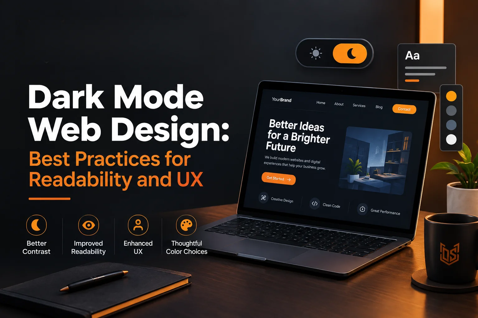
Dark mode is everywhere now. Phones default to it. Apps ask you to pick it on first launch. Websites are catching up too and for good reason. A dark theme can feel modern and it can also cut eye strain during long reading sessions.
But dark mode is not just flipping colors. A white background does not simply become black and call it done. Text can turn hard to read. Buttons can lose their punch. Images can look washed out or too harsh against a dark backdrop.
This guide breaks down what actually works. You will learn the real rules behind readable dark interfaces. You will see the mistakes that make dark mode worse instead of better. And you will get a simple path to add it to your own site the right way.
What Is Dark Mode Web Design
Dark mode web design means building a website with dark backgrounds and light text instead of the usual white page with black text. Most sites use deep grays or near black tones rather than pure black. Text usually shifts to off white or soft gray instead of pure white.
The idea sounds simple but good execution takes real planning. Every color choice on a light site needs a second look once you flip the theme. Shadows behave differently. Borders need new treatment. Icons often need their own dark set.
Sites that get this right treat dark mode web design as its own design system rather than a filter placed over the existing site.
Key Parts of a Dark Mode System
- A dark background scale using a few shades of gray or navy instead of one flat black
- Text colors with enough contrast to stay readable without feeling harsh
- Accent colors that still pop against a dark base
- Borders and dividers that stay visible without looking too bright
- Shadows and elevation cues that work without a white surface to fall on
- Image and icon treatments made for a dark canvas
Why Dark Mode Matters for UX
People are not asking for dark mode as a trend anymore. They expect it as an option. Many visitors will judge a site as dated the moment they notice it forces a bright white screen with no alternative.
Beyond looks there are real comfort reasons behind the demand. Reading white text on a dark screen at night causes less glare. Users browsing in low light rooms often find it easier on the eyes. On OLED screens a dark theme can also reduce battery drain since black pixels use less power.
None of this means dark mode always wins. It means it needs to be built well when you offer it.
Real Benefits Users Notice
- Less eye strain during night time browsing
- Lower glare in dim rooms or late evening use
- Battery savings on OLED phones and laptops
- A more premium and modern feel for tech and SaaS products
- Better focus on content since bright white edges stop pulling attention
- An accessibility option for users sensitive to bright light
Dark Mode vs Light Mode: When to Use Each
Neither mode is universally better. The right choice depends on your audience and your content. A recipe blog with bright food photography may look strange in dark mode. A developer tool or analytics dashboard often feels right at home in it.
The safest approach for most business sites is offering both. Let the visitor choose or default to their system setting. This respects personal preference instead of forcing one view on everyone.
Signs Dark Mode Fits Your Site
- Your audience is developers, designers or other tech heavy users
- Your product is used for long sessions like dashboards or writing tools
- Your brand already leans modern, minimal or premium
- Your users often work at night or in low light settings
- You already have strong brand colors that pop on a dark base
Signs You Should Stick with Light Mode Only
- Your site relies heavily on bright photography like food, travel or fashion
- Your audience skews older and less familiar with switching display modes
- You lack the design time to build and test a second full theme
- Your brand identity depends on a clean, white and airy feel
Color and Contrast Rules for Dark Mode
Contrast is where most dark mode designs fail. Pure white text on pure black looks harsh and can cause a glow effect called halation for many readers. The fix is softer contrast rather than the maximum possible contrast.
Accessibility guidelines still apply in dark mode. Body text should meet a contrast ratio of at least 4.5 to 1 against its background. Large headings can go slightly lower at 3 to 1. These numbers do not change just because the background got dark.
Brand color also needs testing on its own. A bright orange or blue that pops on white can turn muddy or glaring on a dark base. Many teams brighten or lighten their accent color slightly for the dark theme version so it keeps the same visual weight. This kind of color system planning is part of what a proper branding and UI/UX process should cover before launch.
Contrast Best Practices
- Use off white text like #E6E6E6 instead of pure white #FFFFFF
- Use deep gray backgrounds like #121212 instead of pure black
- Check every text and background pair against WCAG contrast minimums
- Test brand accent colors separately for the dark theme
- Avoid placing saturated colors directly next to each other
- Keep error and success colors readable and not just red or green on black
Typography and Readability in Dark Mode
Text behaves differently once the background goes dark. Thin font weights that looked fine on white can appear faint or blurry on a dark base. This happens because light text on dark backgrounds needs slightly heavier strokes to stay crisp.
Line spacing also plays a bigger role than people expect. Tight line height on a dark background can make paragraphs feel cramped and harder to scan. A little extra breathing room goes a long way here.
Typography Fixes for Dark Themes
- Bump font weight up slightly for body text compared to the light version
- Increase line height a touch more than you would on a white background
- Avoid ultra thin font weights for anything under 16px
- Keep paragraph width reasonable so lines do not run too long
- Test real content not placeholder text since actual sentences reveal spacing issues
- Check headings at every size since large light text can glow more than small text
Common Dark Mode Design Mistakes
Many dark mode rollouts fail not because the idea was wrong but because the execution skipped key steps. These mistakes show up again and again across redesigns.
A frequent one is using pure black everywhere. It looks bold in a quick screenshot but tires the eyes fast during real use. Another common issue is forgetting to update photography and logos so they still work on the new background.
Mistakes That Hurt Dark Mode UX
- Using pure black backgrounds instead of soft dark grays
- Copying light mode shadows which barely show up on dark surfaces
- Leaving white logo backgrounds that create harsh bright boxes
- Forgetting form fields, checkboxes and dropdown menus in the redesign
- Skipping contrast checks on hover and focus states
- Not testing the footer separately since footers often get missed in redesigns
Footers in particular need their own pass since they carry links, legal text and contact details that must stay readable. Our guide on footer design for UX and SEO is worth checking before you finalize either theme.
How to Implement Dark Mode on Your Website
Modern browsers already give you a head start. The prefers-color-scheme setting lets a site detect the visitor's system preference automatically. From there most teams build the theme using CSS variables so colors can swap without duplicating every style rule.
A manual toggle is still worth adding even with automatic detection. Some visitors want to override their system setting just for your site. Store that choice so it sticks on their next visit instead of resetting every time.
Steps to Add Dark Mode
- Define your color palette as variables for both light and dark themes
- Set a default theme based on the visitor's system preference
- Add a visible toggle so users can switch manually
- Save the user's choice so it persists across visits
- Test every page template not just the homepage
- Check form buttons and third party embeds like maps or chat widgets
- Run a full contrast audit before launch
If your current site is built on an older platform this might be a good moment to review the whole stack. Our post on choosing the right CMS for your business website covers which platforms make this kind of theme work easier.
Dark Mode and Site Performance
Dark mode can help performance in small but real ways. Large solid color blocks compress efficiently and dark UI elements often need less visual complexity than bright layered designs. On OLED devices, dark pixels also draw less power which extends battery life during use.
None of this replaces proper performance work though. A slow site stays slow no matter which theme it wears. Speed still comes down to image sizes, code efficiency and hosting.
Performance Notes for Dark Themes
- Compress images separately for dark backgrounds since crushed blacks can hide detail
- Avoid heavy box shadows and blur effects that strain rendering
- Test load times on both themes not just one
- Keep font files and icon sets shared between themes to avoid duplicate loading
For a deeper look at speed fixes beyond theme choice check our guide on optimizing website speed and page load time.
Dark Mode SEO, AEO and AI Search Visibility
Search engines do not rank pages differently because of light or dark mode. Google reads your HTML and content regardless of which theme renders on screen. So dark mode itself carries no direct ranking effect.
Where it matters is user experience signals. If a poorly built dark theme makes text hard to read, visitors leave faster and that behavior can indirectly hurt engagement metrics. The same applies to AI answer engines. Tools like Google AI Overviews and other LLM based search features pull from well structured readable pages. A confusing dark theme with broken contrast does not help your content get picked up or summarized well.
Clean semantic HTML, clear headings and readable text remain what actually helps AI and search systems understand your page. Dark mode should never come at the cost of that structure.
Keeping SEO and AEO Strong Alongside Dark Mode
- Keep heading structure and HTML semantics identical across both themes
- Make sure text stays selectable and readable to crawlers in either mode
- Avoid rendering key content only as images inside the dark theme
- Test both themes for contrast since accessibility issues can raise bounce rates
- Run a technical check after launch to confirm nothing broke in either mode
A quick technical pass using our free SEO audit tool can confirm your dark mode rollout did not introduce indexing or structure issues.
Testing and Maintaining Dark Mode Over Time
Dark mode is not a one time build. New pages, new components and new campaigns keep adding elements that need checking in both themes. A banner built only for light mode will eventually ship broken in dark mode if nobody has a process for catching it.
Build a habit of testing new features in both themes before launch. Treat it the same way you treat mobile testing since skipping it leads to the same kind of visible bugs.
Ongoing Dark Mode Checklist
- Test every new page template in both light and dark themes
- Recheck contrast whenever brand colors are updated
- Review third party widgets and embeds after their own updates
- Audit forms and error states regularly since these get missed often
- Keep a shared style guide so new team members follow the same rules
Sites that go through frequent updates benefit from folding this into regular upkeep. Our website maintenance and security service covers this kind of ongoing quality check for growing sites.
Conclusion
Dark mode web design is more than a color swap. It touches contrast, typography, spacing, images and even performance. Done well, it gives users a genuine choice and a more comfortable reading experience. Done poorly, it creates a harsh screen that is harder to use than the light version it replaced.
Start with contrast since it affects readability the most. Move through typography spacing and component testing from there. Treat dark mode as its own design system rather than an afterthought and it will hold up as your site grows.
Frequently Asked Questions
What is dark mode web design?
It is a website theme that uses dark backgrounds with light text instead of the standard white background with dark text. It is built as its own color system rather than a simple color flip.
Does dark mode help with eye strain?
Yes, for many users, especially in low light settings. Reduced glare and lower brightness make longer reading sessions feel easier on the eyes for most people.
Is pure black the best background for dark mode?
No. Pure black next to bright white text often causes glare and eye strain. Soft dark grays or deep navy tones with off white text usually read better.
Does dark mode affect SEO rankings?
Not directly. Search engines rank based on content and HTML structure not visual theme. Poor readability in dark mode can indirectly hurt engagement though.
Should every website offer dark mode?
Not necessarily. Sites built around bright photography or older audiences may not benefit as much. Tech tools, dashboards and content heavy sites usually see the biggest upside.
What contrast ratio should dark mode text use?
Body text should meet at least 4.5 to 1 contrast against its background. Larger headings can use a slightly lower ratio of 3 to 1.
Can dark mode save battery life?
On OLED and AMOLED screens yes. Dark pixels use less power than lit white pixels so battery use can drop slightly during dark mode browsing.
How do I add dark mode to my website?
Use CSS variables for your color palette, detect the visitor's system preference with prefers-color-scheme and add a manual toggle that saves their choice.
Why does my dark mode text look blurry?
Thin font weights often look faint or blurry on dark backgrounds. Increasing font weight slightly for dark mode usually fixes this.
Do images need separate treatment for dark mode?
Often yes. Logos with white backgrounds and photos with bright edges can look out of place. Many sites prepare separate transparent or adjusted versions for the dark theme.