
Banners play an important role in marketing campaigns. They appear on websites, social media platforms, display ads, and email headers.
Professional banners are not about flashy graphics or complex effects. A good banner captures attention, delivers a clear message, and supports your brand identity.
You do not need years of design experience to achieve this. With the right approach, you can create banners that look clean and perform well. What matters most is understanding the basics and applying them with intention.
In this guide, I will walk you through how to create professional banners step-by-step. You’ll learn how to plan your banner, design it with confidence, and align it with your marketing goals.
Key Steps on How to Create Professional Banners that Stand Out
Creating marketing banners that stand out starts with having a clear plan before you begin designing. Follow these steps to learn how to create professional banners that support your digital marketing efforts.
1. Define the Goal of Your Banner
One of the most important steps on how to create professional banners is having a clear and specific goal before any design work begins.
Start by asking what you want the banner to achieve. Are you trying to increase brand awareness, promote a limited time offer, or display a new product? Each of these goals requires a different approach to layout and messaging.
For example, a banner aimed at brand awareness might use bold brand colors and eye-catching visuals. A banner meant to drive conversions should focus on concise messaging and a strong CTA.
Set measurable objectives, like clicks, sign-ups, or purchases. Make sure every banner design decision supports achieving this specific goal.
Choose the Right Banner Size and Format
Another important step in how to create professional banners is selecting the correct size and format for where the banner will appear.
Different platforms have different standards which will affect how your banner displays on those platforms. For example, website banners typically follow wide, horizontal dimensions just like the Black Friday example below.
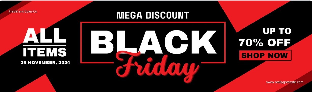
Image via Canva
Social media platforms, on the other hand, follow specific, high-resolution dimensions for banner designs tailored for mobile-first viewing.
Before you begin designing, confirm the exact dimensions you need. This will help you plan design spacing and text placement properly. It also ensures that important elements like headlines and calls to action remain visible across devices.
For marketers an online banner maker can provide professionally-designed templates that are tailored for different platforms. These templates often have predefined sizes, balanced layouts, and built-in design elements to create platform-ready banners.
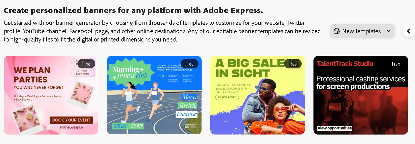
Image via Adobe
Proper sizing and formatting helps maintain visual quality and ensure your banner looks polished wherever it appears.
Build a Strong Visual Hierarchy
Visual hierarchy is an important aspect to consider when learning how to create professional banners that communicate effectively. It determines how the viewer processes information and where their attention goes first.
Start by identifying the primary message of the banner. This is usually the headline or offer and should be the most visually dominant element through size, color, or positioning. Secondary information should support the main message without overpowering it.
For example, in this event banner template, the core message “Beauty Festival” has a large font size and central placement which is the first element viewers notice. Other banner details are written in a way that complements the headline.
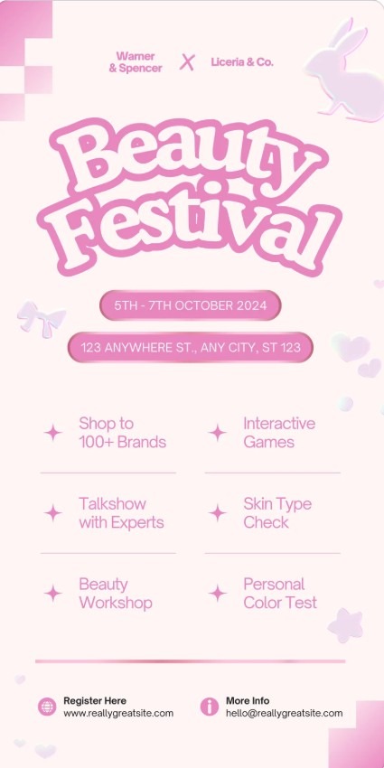
Image via Canva
Adequate spacing between elements is also important to improve readability. When elements are too close together, the banner may be difficult to scan.
Use Brand Consistent Colors and Typography
Incorporating brand elements into your marketing banner designs is one of the clearest signals of professionalism. Your banner should create a strong first impression so that viewers can recognize that it belongs to your brand. Colors and fonts work together to create that recognition even before the message is read.
This approach is important if you want to create professional banners that support long m-term brand growth.
Primary brand colors are best used for key elements like headlines, buttons or banner backgrounds. Secondary colors can support the layout and can be used for the banner text. Avoid using too many colors as this can make the banner feel messy and unfocused.
For example, this Acer promotional banner features Acer’s signature green across the background with white color used for the text.

Image via Acer
Typography is just as important as color when it comes to brand consistency. The key is to choose fonts that are easy to read and align with your brand voice. Font size and spacing should also be considered carefully. Text should remain readable on both large and small screens.
Write Clear and Focused Banner Copy
When learning how to create professional banners, writing a copy is an important aspect to pay attention to. Your banner copy is what can turn a good design into an effective marketing asset.
Most viewers glance at a banner for only a moment before moving on, so your banner copy should be clear and catchy at a glance.
Start by identifying the single message the banner needs to communicate. This could be an offer, a product, or an announcement. Your banner copy should focus on one idea instead of several competing points.
The headline should carry the main idea which should be specific and communicated with a few words or short sentences. Supporting text can add a bit more context, but it should never compete with the headline. This text should explain or reinforce the main message in a simple way.
See an example of a banner by Ultra Pet with a catchy headline copy, supporting text and a simple layout that keeps the focus on the main message.
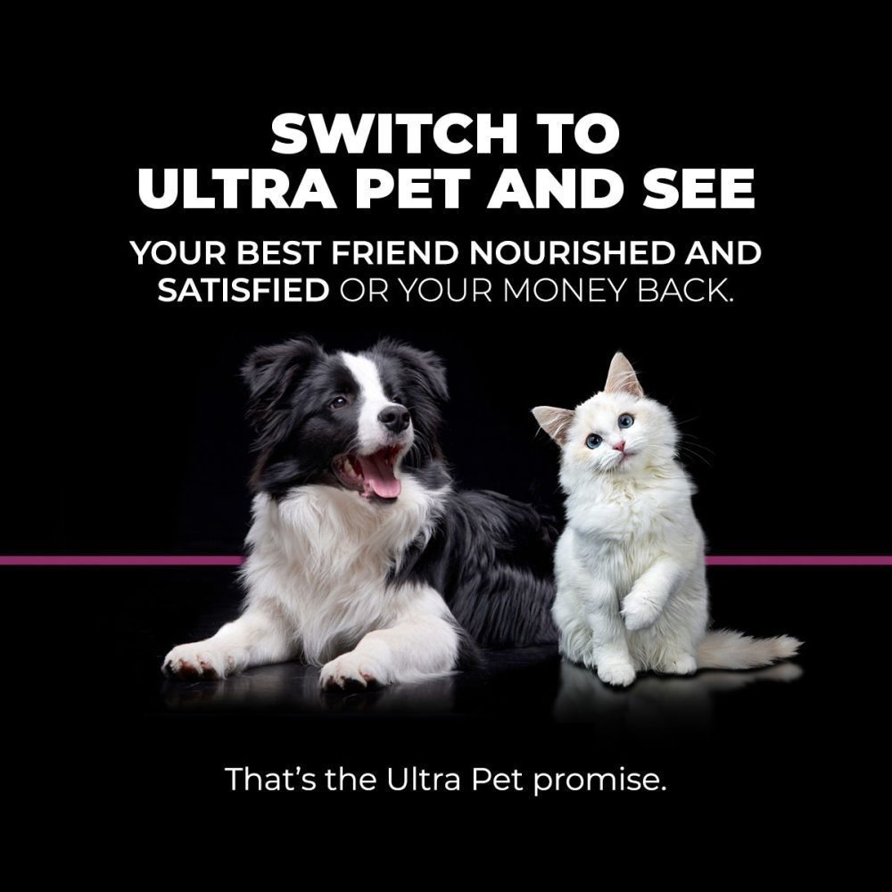
Image via Ultra Pet
You can also include a CTA that tells viewers what to do next. Use simple action-based words that match the goal of the banner and feel natural to the message.
Use Images That Support Your Message
Images are one of the most powerful tools in banner design because they can communicate ideas faster than words. Understanding how to create professional banners means knowing how to choose images that add meaning and clarity to your design.
When choosing an image, think about relevance first. The image should clearly relate to the product, service, or offer being promoted. Clean, high quality images work best because they maintain a professional appearance across your web design and other platforms.
Also, images should also be consistent with your brand identity. Use colors, lighting, and style that match your visual language. It is also important to consider placement and size. The image should complement the headline and supporting text, leaving enough space for the message to remain clear.
Final Thoughts
Knowing how to create professional banners for any marketing campaign is important to communicate a clear message. Throughout this guide, we’ve emphasized that creating professional banners involves planning, clear hierarchy, and intentional use of colors, typography, images, and copy.
Every element should work together to highlight the main message and guide the viewer’s attention where it matters most.
You can test your professional banners on different devices and platforms to ensure they look good everywhere. Pay attention to spacing, readability, and visibility. Small adjustments can improve how viewers perceive your message and increase engagement.
Finally, keep learning and observing what works. Look at banners from other brands and note what draws attention and can support your marketing goals.