
 Sign up with Google
 Sign in with Zoho

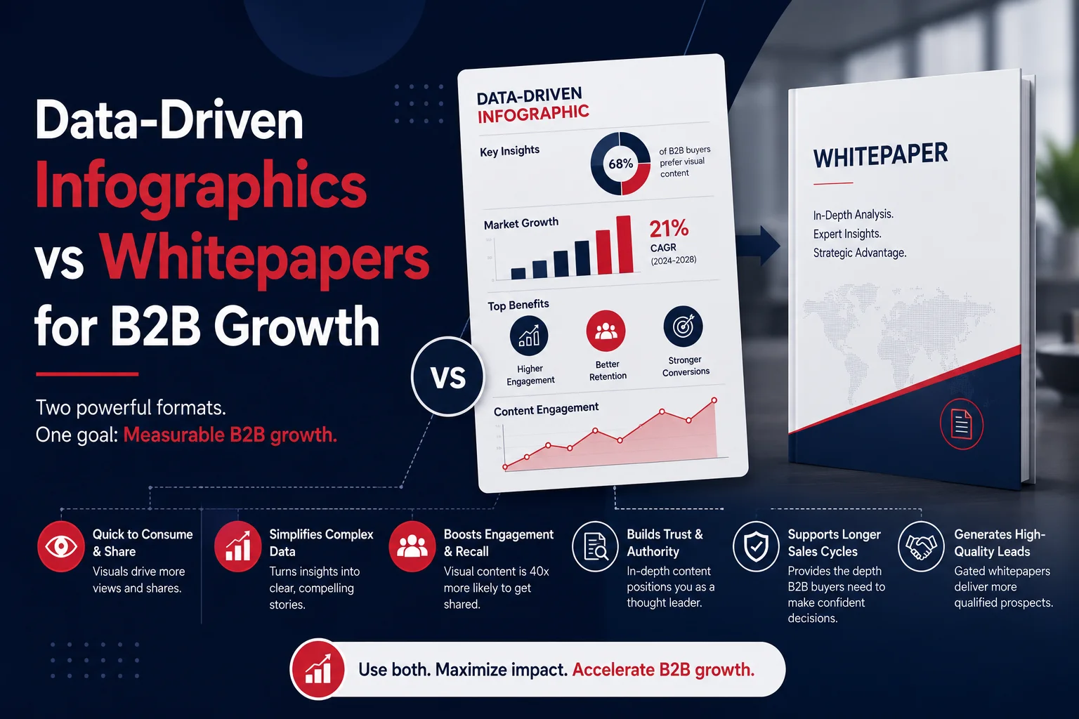
A marketing team spends weeks researching industry data, interviewing experts, and writing a 25-page whitepaper. The report is published, shared on LinkedIn, and promoted through email campaigns. A few hundred people download it, but only a small percentage read beyond the first few pages.
A month later, the same team pulls out the strongest statistics from that report and turns them into a visual infographic. Within days, it attracts far more shares, earns backlinks, sparks conversations on social media, and becomes a useful asset for the sales team.
This happens more often than many B2B marketers expect. The difference isn't that whitepapers have lost their value. It's that buyers now consume information differently, especially during the early stages of research.
B2B Buyers Are Short on Time
Decision-makers aren't reading less because they care less. They're reading less because they're trying to evaluate more options in the same amount of time.
A procurement manager might review five vendors before lunch. A marketing director could be comparing reports while answering emails and preparing for meetings. Long-form content still has a place, but it usually isn't the first thing people reach for.
Visual content fits naturally into this reality. It helps busy professionals understand the main points without asking them to commit to reading dozens of pages.
Infographics Answer Questions Faster
Whitepapers are designed to explain a topic in depth. They provide research, methodology, supporting evidence, and detailed analysis.
Infographics serve a different purpose. They simplify information without removing its meaning.
A well-designed infographic allows readers to quickly identify:
- Key industry trends
- Important statistics
- Process comparisons
- Research findings
- Market changes
- Business outcomes
When someone can understand the core message in two minutes instead of twenty, they're more likely to engage with the content.
Visual Information Is Easier to Remember
Think about the last conference presentation that stood out.
Chances are it wasn't because every slide contained paragraphs of text. It was probably because the speaker used charts, diagrams, or visuals that made the information easier to follow.
The same principle applies to B2B marketing.
When statistics are paired with meaningful visuals, readers are more likely to remember the insight behind the number. Instead of seeing "42% growth" as another data point, they immediately understand what that growth represents and why it matters.
Good design helps information stay with the audience long after they've finished reading.
Infographics Travel Further Than Whitepapers
Whitepapers are usually downloaded, saved, and sometimes forgotten.
Infographics, on the other hand, naturally fit into the places where professionals already discover content.
A single infographic can be repurposed for:
- LinkedIn posts
- Sales presentations
- Industry blogs
- Email newsletters
- Conference displays
- Media outreach
- Internal training
- Executive summaries
That flexibility gives marketing teams more opportunities to extend the value of their original research without creating entirely new content.
Sales Teams Actually Use Them
One challenge with long-form assets is that they aren't always practical during live conversations.
Sales representatives rarely send a 30-page report during a meeting and expect prospects to read it on the spot.
An infographic works differently.
It can explain industry trends, summarize customer research, or highlight business outcomes in a format that's easy to discuss during a call. It also gives prospects something useful they can share internally with other stakeholders.
When content becomes easier for sales teams to use, it naturally reaches more people.
Data Builds Trust. Design Builds Understanding.
Numbers alone don't persuade people.
If a chart is confusing or the information lacks context, readers may overlook valuable insights.
Strong infographics combine credible research with thoughtful visual storytelling. They guide readers through the information instead of expecting them to interpret every graph or statistic on their own.
This is where design becomes part of communication rather than decoration.
Whitepapers Still Matter—Just at a Different Stage
Choosing infographics over whitepapers isn't an either-or decision.
The two formats work best together.
An infographic creates interest by presenting the highlights. A whitepaper provides the detailed evidence for readers who want to explore the topic further.
For many enterprise organizations, the infographic becomes the entry point that encourages readers to download the complete report later.
Instead of competing, the two assets support different stages of the buying journey.
What Makes a B2B Infographic Worth Reading?
Not every infographic earns attention.
The strongest examples usually have a few things in common.
They Focus on One Story
Trying to explain an entire research report in one graphic usually creates clutter.
Successful infographics highlight one central idea and build the supporting data around it.
They Use Reliable Data
Readers expect every statistic to come from credible sources.
Clearly presenting research findings helps strengthen confidence in both the content and the brand behind it.
They Remove Unnecessary Complexity
Good design doesn't add visual effects for the sake of appearance.
Instead, it removes distractions so readers can focus on the information that matters most.
They Fit Multiple Formats
An infographic should work on a landing page, inside a presentation, in an email, or on social media without losing clarity.
Planning for reuse increases the value of the original content investment.
Where Presentation Design Fits Into the Process
Many enterprise marketing teams already have valuable research sitting inside reports, surveys, customer studies, and industry analyses. The challenge isn't creating more information—it's making that information easier to consume.
That's where presentation design services become valuable. The same design principles used to improve executive presentations can also turn complex research into visual assets that are easier to understand, easier to share, and more useful across marketing and sales channels.
Instead of asking audiences to work through dense pages of content, businesses can present key insights in a format that encourages attention and discussion.
Final Thoughts
Whitepapers continue to play an important role in B2B marketing, particularly when buyers are evaluating vendors in detail. But earning that level of attention often requires a stronger first impression.
Data-driven infographics help bridge that gap. They make research more accessible, extend the reach of existing content, and give marketing and sales teams an asset people are more likely to read, remember, and share.
For organizations looking to get more value from their research, Tangence recognizes that thoughtful visual communication and well-executed presentation design services can help important ideas reach the right audience in a way that's both clear and compelling.



.webp)