
 Sign up with Google
 Sign in with Zoho

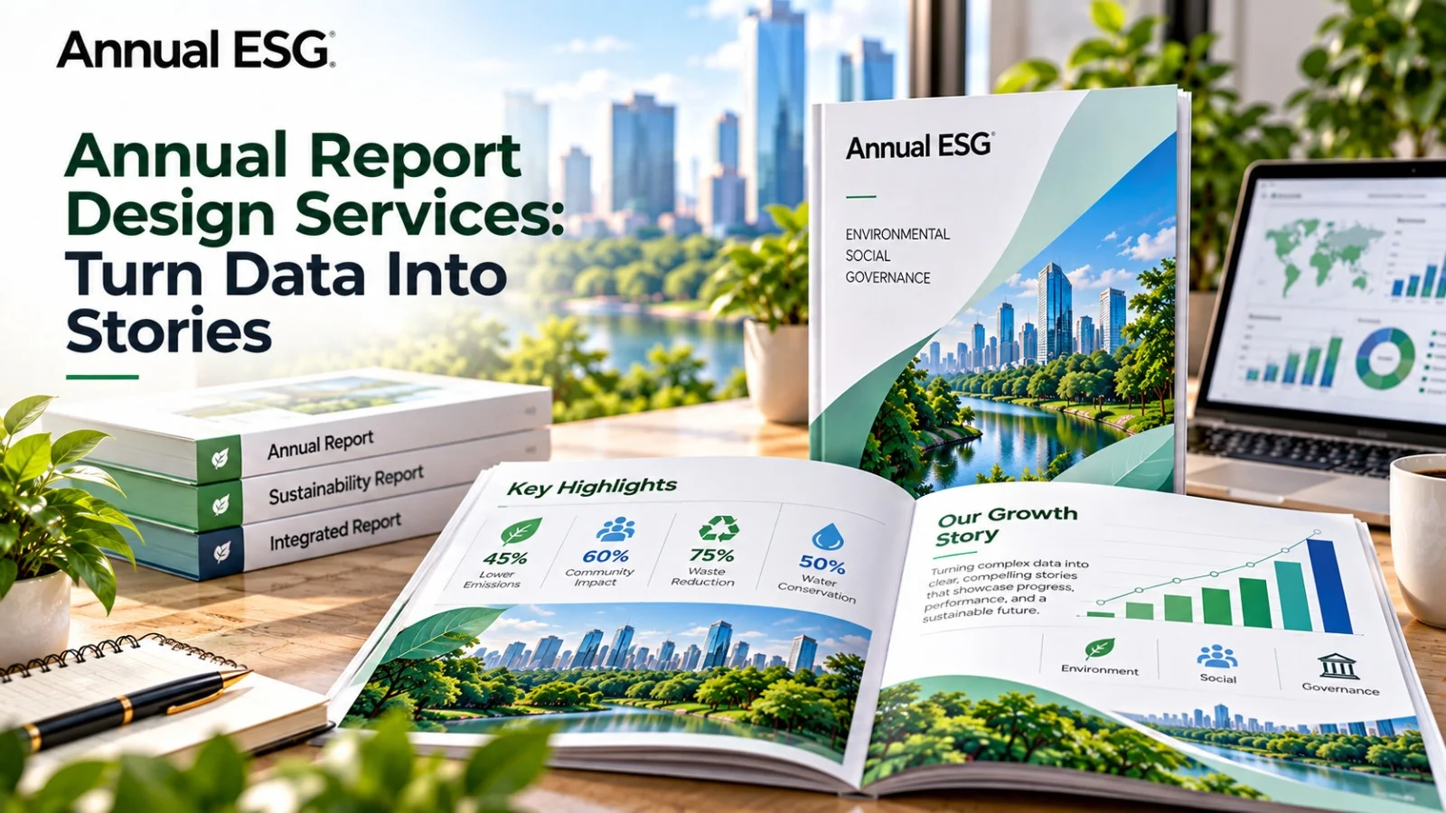
Annual report design services turn business data into visual stories by pairing a clear narrative with accurate charts, strong hierarchy, and plain language. Readers see what happened, why it matters, and what comes next. Numbers stop being a wall of text and start making a case.
Intangible assets make up 90% of S&P 500 market value (Source: Ocean Tomo, 2020). Investors must grasp strategy, not just figures. Raw data alone rarely tells that story. This post explains how design turns data into narrative, which visuals fit which numbers, how digital formats help, and how to run the project.
How Do Annual Report Design Services Turn Data Into Visual Stories?
Annual report design services turn data into visual stories in four steps. They find the core message, match each dataset to the right visual, set a clear reading order, and pace the pages so each spread makes one point. The reader follows the argument without effort.
What Is Visual Storytelling in an Annual Report?
Visual storytelling links figures to people, products, and outcomes. A revenue chart shows growth. A customer example shows why it happened. Each page carries one idea, supported by one visual and a short caption.
How Does a Designer Find the Story?
The designer starts with questions. What changed this year? What risks grew? Where does strategy go next? The team then ranks the answers and gives the top ones the most space. Teams that want this step handled inside one workflow often work with annual report design services to connect narrative, charts, and production.
Why Does Narrative Beat a Data Dump?
Most readers skim. Web users read only 28% of the words on an average page visit (Source: Nielsen Norman Group, 2008). A story gives skimmers a path. A data dump gives them a reason to quit.
How Do You Present Financial Data Visually?
Present financial data visually by choosing one chart type per question, labelling every axis, stating the unit and period, and adding a one-line takeaway above each graphic. Keep tables for exact figures. Use charts for trends and comparisons.
Which Chart Types Work Best?
Match the format to the question:
How Do You Keep Charts Honest?
Start axes at zero for bars. Keep decimal places consistent. Use one colour for each category across the whole report. Check every figure against the financial statements. Readers who spot one mismatch will doubt the rest.
When Do Infographics Help?
Infographics work for processes, timelines, and progress against goals. Keep each one to a single message. Cut any element that does not carry data. Label it so a reader understands it without the surrounding text.
How Do You Build a Narrative in an Annual Report?
Build a narrative by opening with the year's headline results, explaining the drivers, then linking them to strategy and risk. Use the same order in each section. Short paragraphs, plain headings, and clear transitions keep readers moving.
How Should Pages Flow?
Open with a highlights spread. Follow with the leadership message and strategy summary. Place detailed disclosures behind clear headings. Vary page density so dense sections alternate with open, visual ones. Pacing prevents fatigue.
How Do Standards Shape the Story?
Frameworks set the content, and design shapes how readers meet it. GRI standards and the IFRS Foundation's Integrated Reporting Framework guide what companies disclose. Design must keep that volume readable. Consistent tables, clear labels, and cross-references stop extra data from turning into noise.
Do Visual Annual Reports Improve Investor Understanding?
Yes, when the visuals stay accurate and simple. Clear graphics let investors compare years, spot risks, and verify claims fast. Decorative or distorted graphics do the opposite. Clarity builds confidence. Style without substance erodes it.
Do Digital Reports Add Value?
Digital reports let readers filter by year or segment, download data, and jump between sections. Companies listed on EU regulated markets must file annual financial reports in ESEF (Source: European Securities and Markets Authority, 2020). Plan the visual layer and the tagging layer together from the start.
Does Visual Design Affect Accessibility?
It can. WCAG standards cover contrast, reading order, tagging, and alt text. Pale colour palettes and text over photos often fail those checks. Test early. Accessible design reaches more readers and avoids rework.
How Should You Plan the Project?
Start before the audit ends. The designer builds templates while finance finalises figures. Set a content freeze date. Name one person who signs off on each section. Fewer reviewers mean fewer late edits.
Conclusion
Annual report design services turn business data into visual storytelling by finding the core message, matching charts to questions, and pacing each page. Honest graphics and clear structure build investor trust. Accessible, well-tagged files extend that trust to every reader and format.
Strong annual report design services start early and bring finance and communications teams together. As reporting demands grow, which story will your numbers tell next year?